
Inflation, Inflation, Inflation. It’s going crazy!! When’s it gonna end? 👈 THAT’S the million dollar question.
I came across another fantastic (updated) chart from one of my favorite LinkedIn economist connections, Jay Parsons. He’s tracking actual national asking rents against the CPI rent (shelter) component. Who cares, you ask? Well, if you’re considering buying a home, you’ve got to be completely frustrated about these crazy high mortgage interest rates, so hear me out.
First, let’s make sure we all understand what CPI is and why the shelter component of the CPI is extremely important right now.
From Nerdwallet: The CPI measures the change in prices paid by U.S. consumers for everyday goods and services, like groceries, gas and rent. It’s calculated by the U.S. Bureau of Labor Statistics and tracks real-world impacts of inflation on consumers. Every month, the BLS releases updated CPI data, showing monthly and annual changes in average prices.
The Federal Reserve closely monitors the CPI and uses this indicator (among others) to decide whether to raise, lower, or keep interest rates steady. Since Covid, inflation has been going nuts and the Fed has raised interest rates 11 times since March 2022, to combat this rising inflation. These interest rate hikes have spilled over to the Mortgage Market and pushed 30-year fixed mortgage rates to 20+ year highs around 7.5%. Nobody is happy about that, but it appears there is light at the end of the tunnel.
Let’s look at the largest data component of the all-important CPI 👉 the CPI Rent or “Shelter Component.” The shelter component is a measure of the cost of housing for individuals and households. It’s a major component of CPI — making up 32.8% of the headline number. It includes various housing-related expenses such as rent, homeowner’s equivalent rent (which estimates what homeowners would pay if they rented their homes), and related costs like property insurance and maintenance. The shelter component is a significant part of the CPI because housing costs are a major expense for most people, and it plays a crucial role in calculating overall inflation rates.
OK…now let’s look at the below chart which plots the shelter component (CPI Rent) against actual Asking Rents. Notice how there is a 12-month lag between the two datasets. Actual rents (in orange) shave been falling since 3/2022, but the CPI rent component (in green) was still rising and didn’t peak until 3/2023 – 12 months later! Keep in mind, this is what the Fed watches – a 12-month lagging indicator that makes up almost 33% of the CPI. UGH!! So what’s the bottom line here?
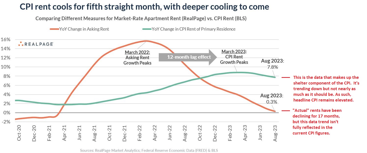
Chart source: Jay Parsons – LinkedIn
BOTTOM LINE: A leading indicator (Asking Rents) is suggesting that the Shelter Component of CPI has A LOT more room to fall. A LOT. This is good for inflation expectations and should eventually lead to lower interest rates going forward. For prospective homebuyers looking to finance their purchase, there’s light at the end of the tunnel. 👍

